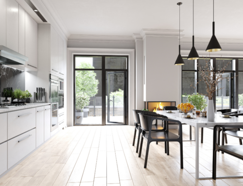
How to Choose Paint Colors for Your New Kitchen

After purchasing a home, you may find it to be a blank slate just waiting for your personal touches. That’s no mistake; one of the best tips for selling a home is to make it appealing but neutral. If you find those beige or off-white walls boring, you’ll probably want to paint… and the kitchen is an excellent place to start.
Choosing Paint Colors for Your New Kitchen: Think About the Size First
If your new kitchen is on the small side, it’s best to stick to light, airy colors. Paler hues tend to feel more open and give the illusion of a larger space. For variety and depth in a small, rectangular kitchen, you can choose a light or bright tone for the two longer walls and go a couple shades deeper (not too dark) on shorter walls.
A larger kitchen gives you more room to be dramatic. Bold colors won’t crowd a spacious room, and using textures or stripes can express your personal style. Keep in mind that you may need additional lighting if you decide on rich, deep colors for your kitchen.
How to Pick the Right Colors
If the choice of colors at the paint store seems overwhelming, it’s easy to narrow down the options by looking at dinnerware for cues. Think about it this way: companies pay experts to find the perfect shades and styles, so they’ve done half the work for you. (Check out Pfaltzgraff’s latest lines, Pier 1 Imports’ newest styles, and Mikasa’s trending dishes for inspiration.)
Know Your Paint Color Terminology
When you’re shopping for paint colors, it’s helpful to know all the right terminology so you can make the right choices.
Some of the key terms include:
- Hue. Hue is simply another word for color. (Red is a bold hue that you should only use if you’re sure it won’t look tacky, for example.)
- Value. A hue’s value refers to how light or dark it is. The darker it is, the lower the value; that means royal blue has a low value, while periwinkle has a high value.
- Saturation. Saturation refers to how dominant the hue is. When you go from royal blue to periwinkle, the hue becomes less dominant — and therefore the color is less saturated.
- Intensity. Intensity refers to how brilliant the color is. Primary colors (red, yellow and blue) are typically more intense than combined colors are. Stronger, more intense colors most often have more dominant hues.
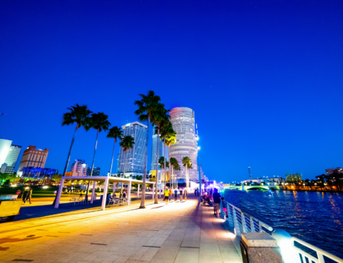
Are You Looking for a New Canvas in the Tampa Bay Area?
If you’re looking for a new home that you can customize so it’s all your own, we can help you find the perfect place.
Whether you’re looking in Pasco, Pinellas or Hillsborough County, we’ll use our in-depth expertise to your benefit.
Call us at 727-584-8480 or 813-961-6000, or get in touch with us online. We’ll be glad to help you find your next home.
 $6,750,000
Active
$6,750,000
Active
609 N Dale Mabry Highway Tampa, Florida
15,689 SqFt 1.080 Acres
 $2,198,000
Active
$2,198,000
Active
13030 E Us Highway 92 Dover, Florida
584,575 SqFt 13.420 Acres
 $2,198,000
Active
$2,198,000
Active
13030 E Us Highway 92 Dover, Florida
3 Beds 2 Baths 1,677 SqFt 13.420 Acres
 $1,550,000
Active
$1,550,000
Active
31 Concord Drive Dunedin, Florida
4 Beds 3 Baths 2,749 SqFt 0.170 Acres